


PROCESS
Click the link bellow to see the implementation process:
https://prezi.com/eeuwpl-crcet/haak-studio-prezentare-eximtur-the-travel-company/
BRIEF
At the intersection of Andrei Saguna and Tipografiei Streets with Frédéric Joliot-Curie Street is located a collective residential building, built in 1960 as part of the systematisation project for the Mihai Viteazul Square. At the ground floor of this building, resides Eximtur travel agency. The space occupied by this agency is the result of a merger of three housing units through a project originally developed in the 1990s.
The brief of the of the new intervention addresses issues of functional and aesthetic order: the refunctionalization of the activity areas, namely generating a fluid space with a contemporary and homely atmosphere for employees and customers as well.
CONCEPT
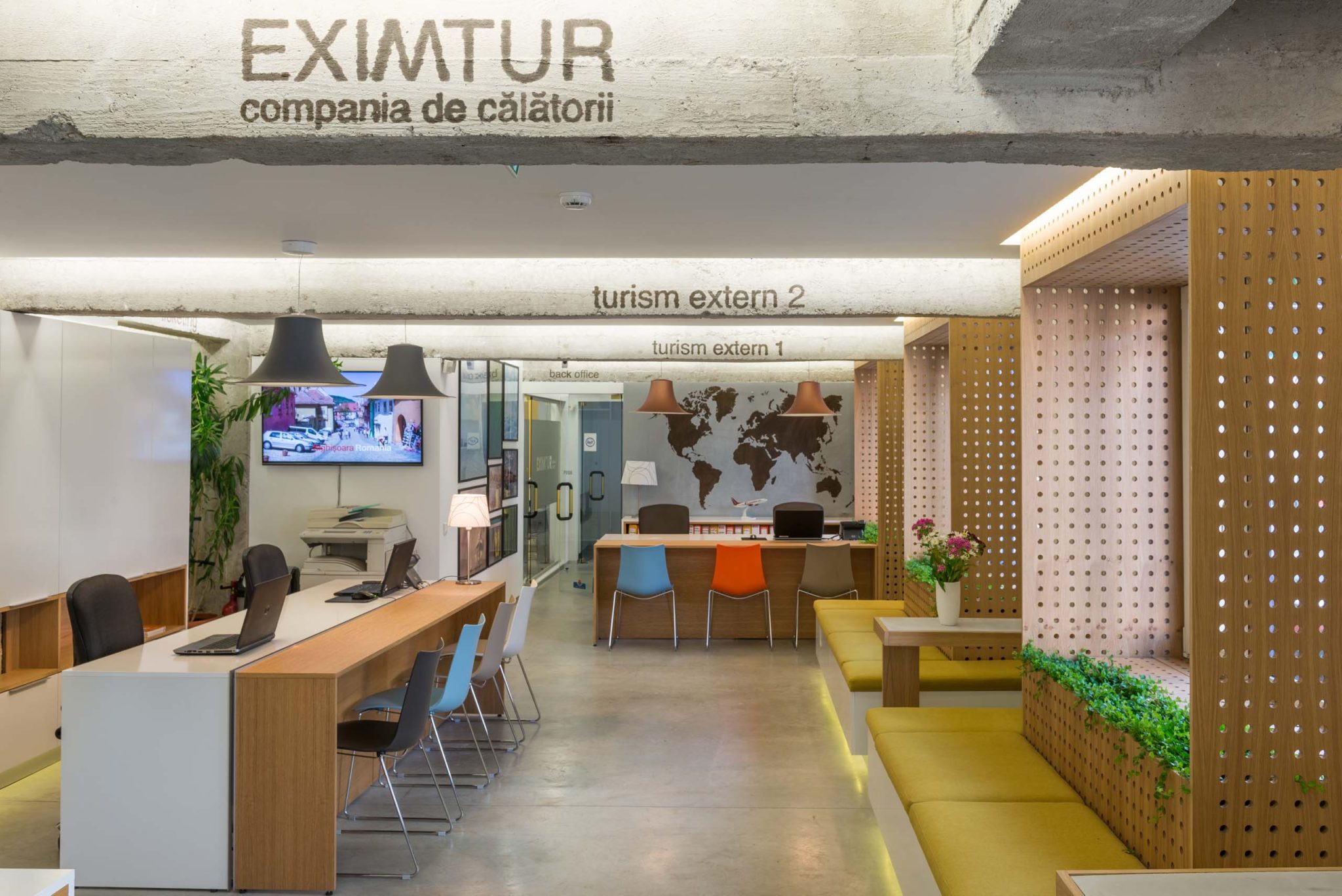
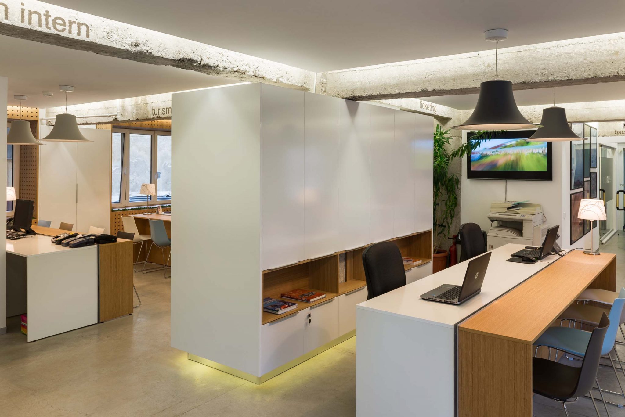
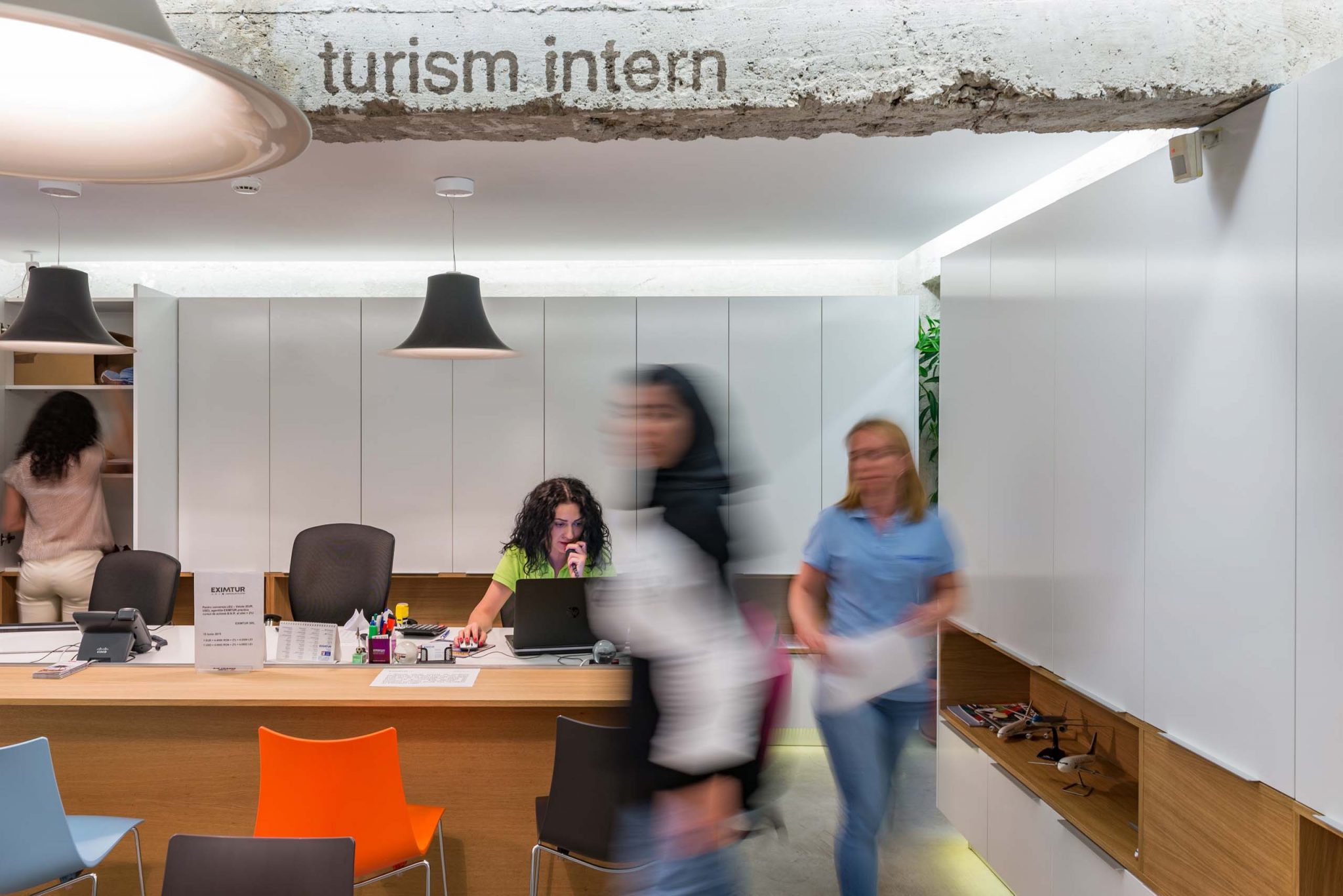
The concept of the project promotes a dialogue between the existing fund, the architecture of the 1960s and the new insertion. This dialogue is proposed on two different levels. A level where the dialogue is established between construction techniques and raw materials resulting from pickling existing finishes with similar materials and materials but with contemporary techniques. From this point of view the concept is based on the contrast between raw and finished as a means of enhancing the interference between the old – considered valuable – and the new insertion.
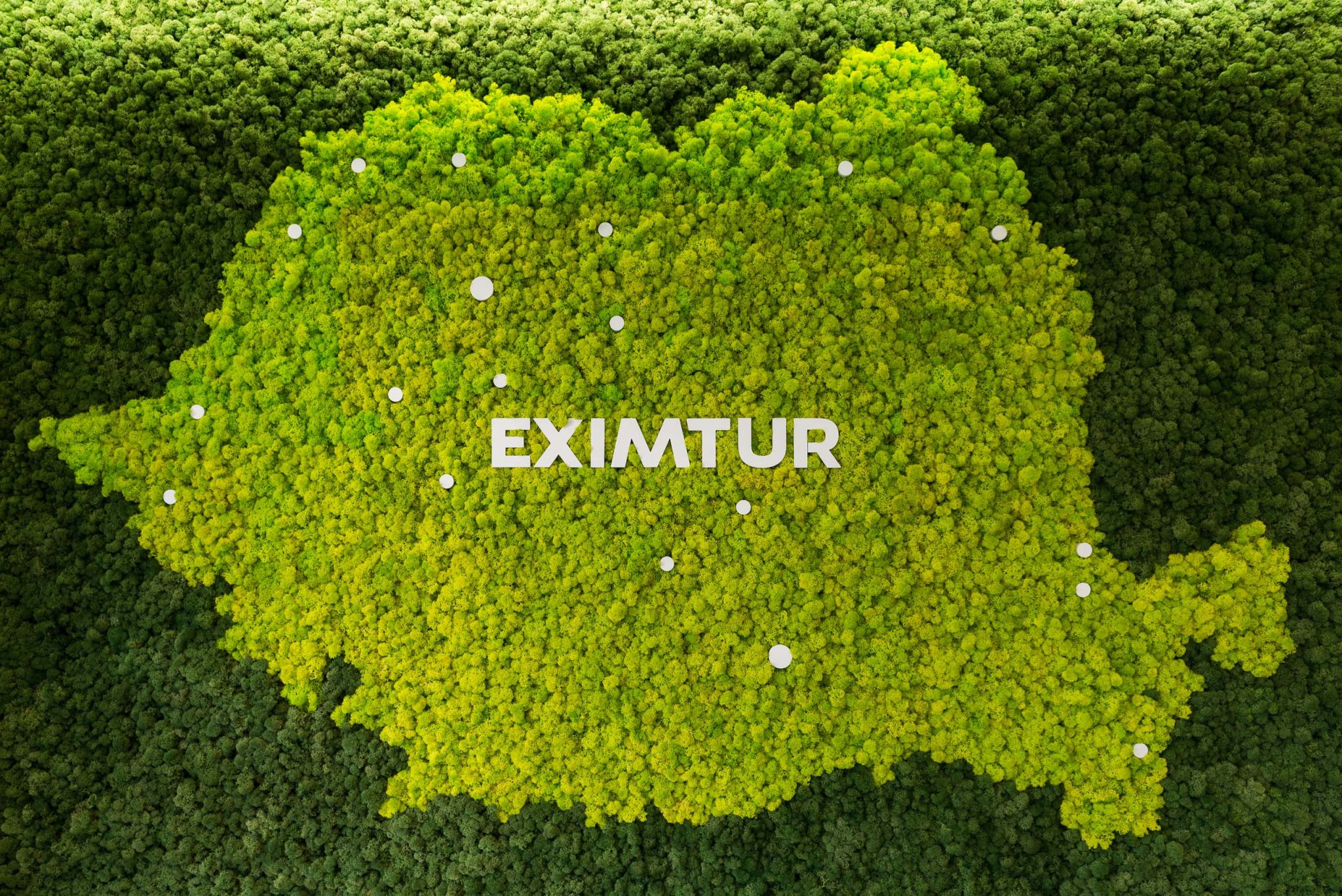
On another level, being a travel agency, we relied on the natural and artificial dialogue. The atmosphere created promotes two major types of tourism: cultural and business tourism which is usually linked to the artificial and leisure tourism which generally relates to natural settings. The project speaks of the specific artificial urban environment by using raw materials such as concrete, glass or polished wood and about the natural by inserting vegetal elements.
CHROMATICS & MATERIALS
At a conceptual level, the chromatic palette is based on the company’s brand and colors but also promotes the physical context of a block of flats from the 60s.
The colour palette substantially relies on different shades of grey from the exposed concrete in contrast with the familiarity of wood, vegetal green, ocher and blue hues taken from the brands logo and color accents for the clients furniture.
ATMOSPHERE
The atmosphere thus created in a space which originally was a housing unit is intended to transpose the users in a pleasant and familiar place. On this consideration furniture elements are proposed as specific to the housing program, and not necessarily specific to a public space.
SOLUTION
The intervention aims to promote a certain sincerity by making transparent specific imperfections of the context in which is inserted. The same imperfections govern our daily lifes and we thought its a pity to hide them under a layer of perfect finishing.


